Kate Dewey is an award-winning brand strategist and
senior graphic designer based in Geelong, Australia.
Kate is also the founder and Creative Director of D&Co Studio.
This website showcases selection of Kate’s work completed between 2015-2022
Some of the clients Kate has worked with include:
Royal Doulton UK
“I led the creative behind the development of packaging for Royal Doulton’s Home Fragrance Range titled The Artisan Collection. The Artisan Collection showcases beautiful, bespoke scents and modern designs that compliment any home.
As part of the project, bespoke patterns, typography, receptacle design and packaging design was created to best showcase each fragrance,
The creation of scent names and complimentary fragrance notes was also developed which included Gardenia & Wild Peony, Burnt Sugar & Vanilla Beech, Coconut Milk & Honey, Sea Salt & Driftwood and Cilantro & Orange Zest.
The launch of the Royal Doulton’s Artisan Collection was been so successful that it was released worldwide.”
Bellarine Urban Farm
“I led the creative behind the development of branding for Bellarine Urban Farm - a regenerative and self sustaining community designed for multi-generational families.
Situated on the edge of Corio Bay at the entrance to Bellarine Peninsula, Bellarine Urban Farm offers true waterfront farm living. Inspired by urban farm models and edible landscapes, this development allows families to grow their own food and discover sustainable living through conscious resourcing.
The brand identity design captures all aspects of Bellarine Urban Farm through the integration of the local landscape (including sea and rolling hills); the close proximity to the urban centre (illustrated through the inclusion of houses and urban structures) and the idea of reclaiming the land for sustainable living (demonstrated through the inclusion of the shape of a shovel/hand trowel).”
Ocean Grove Chalet
“I led the creative behind the development of branding for Ocean Grove Chalet - Ocean Grove’s most luxurious hotel; a new and exciting boutique 15 room resort-style accommodation on the Victorian coast boasting beautiful views of the ocean and just a 100 metre walk from the main shops and cafes.
The brief was to create a logo mark that perfectly encapsulated The Chalet’s beautifully designed premises; appealing to the most discerning traveller.
The has been achieved through a minimalist aesthetic, customised typography and modern colour palette.”
Lake Advisory
“Lake Advisory is an consulting firm specialising in the implementation and project management of social infrastructure projects.
Lake Advisory approached me to create a brand which Lake Advisory’s readiness to solve the unexpected, the agility to adapt, and the tenacity to pursue innovative solutions.
Lake Advisory primarily collaborates with with Government agencies on large scale, infrastructure projects.
It was important that their brand communicated effectively with this target market and embodied their values around collaboration and excellence in the delivery of complex projects.”
Diamond Estate Agents
“Diamond Estate Agents is a boutique real estate agency that prides itself on being a cut above when it comes to property expertise.
Established 10 years ago, the experienced agents of Diamond expertly guide customers in making clear and confident property decisions. They are trusted for residential sales, leasing and investment properties, land sales, house and land packages and property management.
I was contracted by Diamond Estate Agents to help revitalise their brand as they felt their identity didn’t align with their values as a full-service real estate agency. I worked with Diamond Estate Agents to create a brand that modernised their aesthetic.
Their refreshed brand mark is elegant, yet contemporary, showcasing a refined colour palette and polished support graphics that reflect their commitment to achieving brilliant results.”
Vicroads/Regional Roads Victoria
“I was approached by the Community Engagement Team at Regional Roads Victoria (formerly VicRoads) to help them illustrate the proposed areas for Slow Vehicle Turnouts and completed works along various regional roads, including Forest-Apollo Bay Road to present to the local community for feedback.“
National Disability
Insurance Agency
“The NDIS (National Disability Insurance Scheme) takes a lifetime approach, investing in people with disability early to improve their outcomes later in life.
I was approached by NDIA (National Disability Insurance Agency) to assist with the development of multiple pieces of communication to be communicated externally and well as internally across various departments within NDIA/NDIS.
Due to the ongoing nature of the projects completed for NDIA, it was essential that I had a complex understanding of the principles of accessible design for people with disability (eg. colour contrast, font size, spacing, active vs passive images etc).
I am proud to support agencies such as NDIA who assist those in our larger community to be the best they can be.
Pictured above is an example multi-page document produced for their Town Hall Summit, which looks to evaluate current practices within NDIA to ensure a quality and consistent rollout of the National Disability Insurance Scheme (NDIS).”
Sarah Henderson MP
I was engaged as a key design consultant by Sarah Henderson MP (now Liberal Senator for Victoria) during the lead up to her 2016 Federal Election Campaign. Below is a excerpt of the testimonial provided by Sarah:
“I engaged the services of Kate Dewey for some six months in in the lead up to the 2016 federal election campaign for the seat of Corangamite.
From the very beginning, Kate demonstrated an innate ability to understand and communicate the core messages of our local campaign - which focused strongly on jobs, infrastructure and the environment.
Kate delivered highly effective, visually engaging messages and graphics. Her work is of the highest quality and her attention to detail is second to none.
Kate's performance in delivering to very tight deadlines under considerable pressure was exceptional. Frequently she made herself available out of hours to meet our very demanding schedule; nothing was too much trouble.
I certainly regard Kate as a very important factor in running what turned out to be a very successful election campaign.
I highly recommend Kate for her tireless dedication in providing exceptional graphic design and branding services.”
Sarah Henderson MP
Previous Federal Member for Corangamite
Australasian Gaming Council
“The Australasian Gaming Council (AGC) is a international industry body that aims to support a sustainable gambling industry providing entertainment and economic benefits while promoting gambling education, responsible gambling awareness, quality gambling research and evidence-based policy. The Council operates across Australia and New Zealand.
I was approached by the AGC as they required the development of a suite of Factsheets. The purpose of the Factsheets was to translate their data into attractive infographics to help demonstrate how AGC have had a meaningful impact in the governance of the gambling industry across the Australasian region.
The result is highly attractive infographics which allowed very complex data to be consumed by stakeholders in a straight forward, yet meaningful way.”
NineCha
“NineCha is new beverage brand to enter the Australian market.
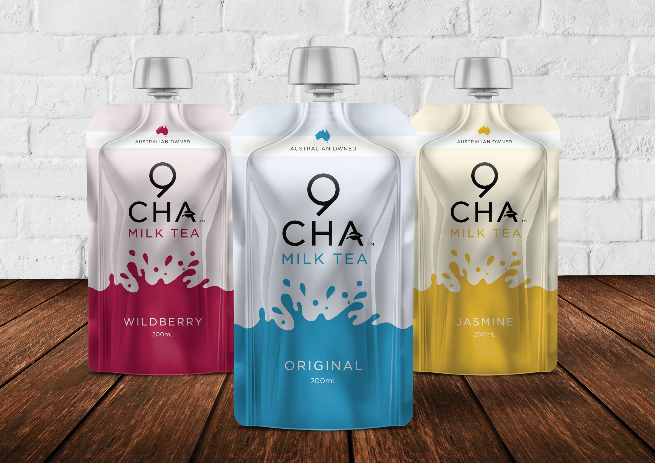
I was commissioned by the client to create the branding for NineCha - which including defining their target market, tone of voice, development of brand identity and packaging design.
NineCha is the first Milk Tea to be made in Australia in a ready to drink format and is available for purchase in Woolworths and FoodWorks Australia wide.
Why the name NineCha? NineCha (roughly translated into Chinese is nǎi chá meaning Milk Tea).
What is in NineCha? The drink has over 95% Australian ingredients and is made with Australian milk, premium Australian water, no preservatives and no artificial colours.”
Naturally COS
“Naturally COS specialises in natural beauty products and organic skin care. Their skincare range is packed with natural botanicals used to treat, heal, and highlight skin’s natural beauty.
I led the creative in association with graphic designer Danielle Kett to rebrand Celebratzio Skincare to Naturally COS. The brief was to capture the Naturally COS’ commitment to organic skincare, utilising a blend of illustrative styles and customised typography.
The end result is a beautifully elegant brand mark which demonstrates Naturally COS’ approach to ethical, organic skincare and honours their dedication to being an environmentally responsible business.”
Momentum Financial Group
“I led the creative on the rebranding of Momentum Financial Group. Momentum FG is a locally based team of specialist accountants and business advisors with an entrepreneurial flair.
Their new brand identity was created on the principles of the Momentum philosophy – the combination of the past, present and future, represented through the use of 3 angled lines in their icon.
The financial services industry can be quite traditional, and whilst this is important, it also meant that there was an opportunity to create a modern brand that separated Momentum from it’s competitors.
Our idea was to strip this barrier away and to represent Momentum as the leader in their field – which they consistently represent through the manner in which they conduct business and assist their clients.”
Epic Taste Experiences
“Epic Taste Experiences offer personalised local food and wine tours that take you on a gastronomical journey of the stunning Greater Geelong Region including Bellarine Peninsula, Moorabool Valley, Surf Coast Shire and The Otways.
I led the the development of the Epic Taste Experiences brand during my tenure as Creative Director of D&Co Studio. They were after a striking brand identity which captured the essence of the local region and the curated tours they provide.
The design of the brand identity for Epic Taste showcases the unique experiences and artisan produce offered by the local Geelong region. It was important that we visually communicate the variety of foodie-based tours that can be facilitated by Epic Taste Experiences.
The overall look and feel were was to communicate was that of a high standard of knowledge of the local region offered by Epic Taste, coupled by their attentive, relaxed and friendly service.”
Citizen360™
“Citizen360™ is a data driven platform focused on servicing the requirements of Government bodies, specifically in the areas of Health and Social Services.
Citizen360™ takes a 360-degree view of the citizen in a single, end-to-end picture of the customer’s journey and experience with Government agency(s). It offers clients an ability to offer the best citizen experience across all channels by allowing for a unified view of all citizen touch points with all services involved in citizen relationships.
I led the creative in the development often Citizen360™ brand. The design of the Citizen360™ logo features an icon, styled to look like a fingerprint. This represents the identity of their citizen themselves and how data captures interactions, across multiple channels and from different sources.”
Alkira
“Alkira Centre is a not for profit organisation, based in the Eastern Suburbs of Melbourne which has been providing services and support to people with an intellectual disability since 1954. Their approach is welcoming and respectful, where participants are truly valued and treated as individuals.
I was approached by Alkira to rebrand their organisation. Their identity takes on a youthful approach, focusing on inclusiveness. The different colours and circles represent people from of all walks of life, working together to create an accessible and positive community.
The dot over the ‘i’ in the logo represents a person, and accompanying half circle in the design represents a smile on the face of those involved with Alkira Centre. Together, the design encapsulates their ethos: belong. connect. aspire.”


